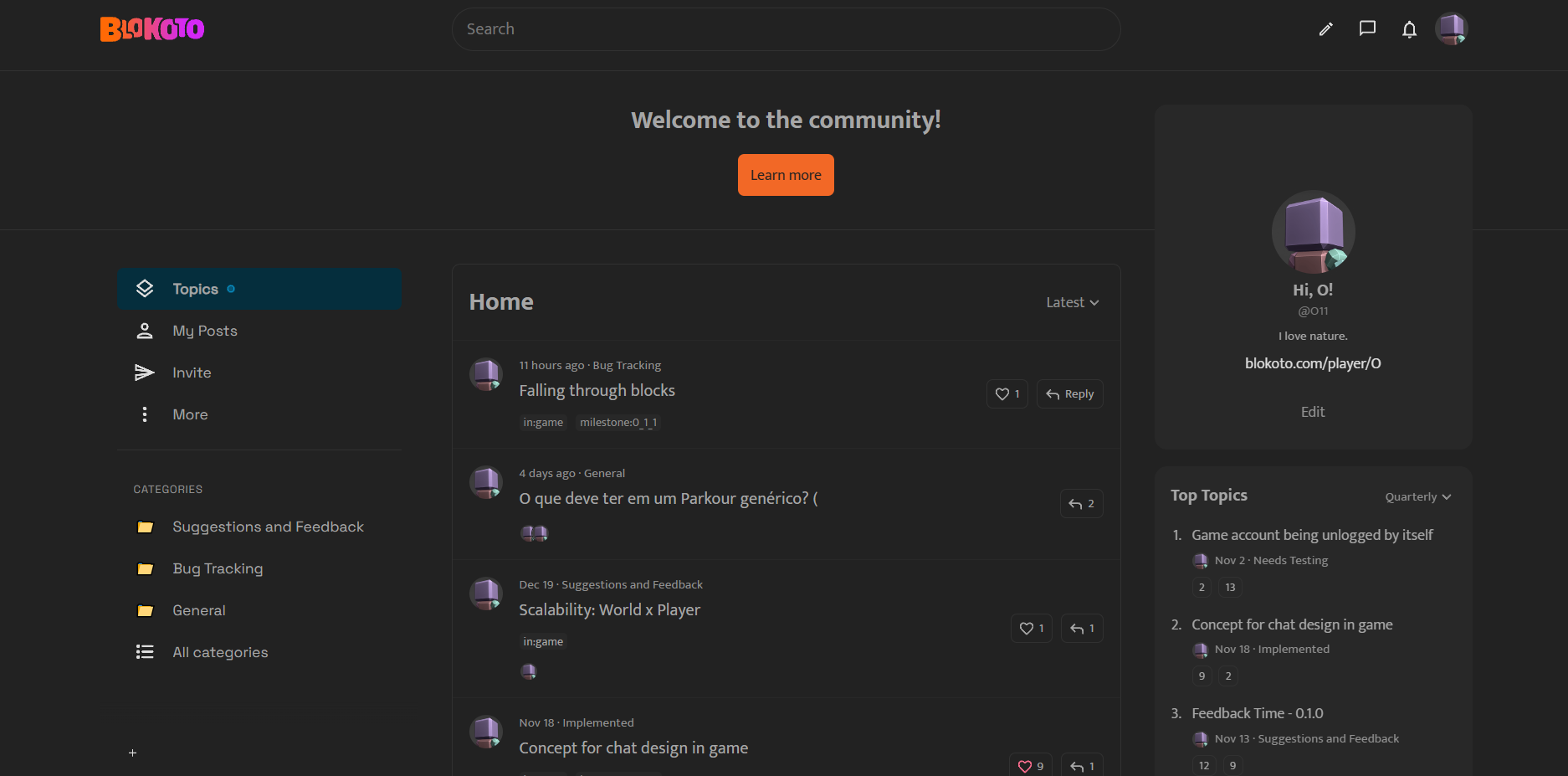
Do you approve new forums look?
- Yes
- No
- Could been better if … (reply below how it could be improved in your opinion)
0
voters
Do you approve new forums look?
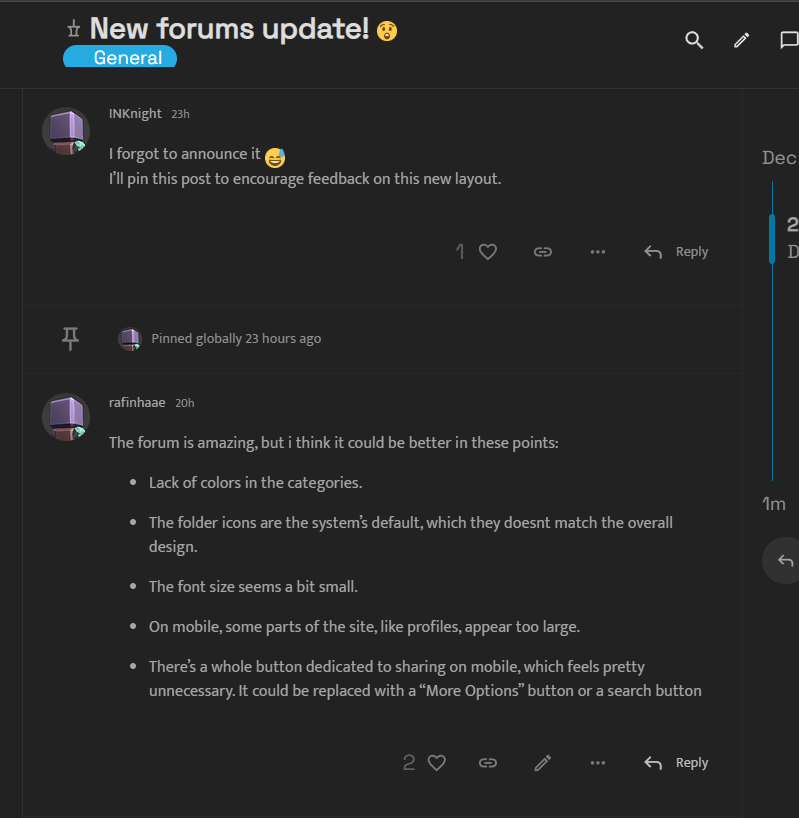
I forgot to announce it ![]()
I’ll pin this post to encourage feedback on this new layout.
The forum is amazing, but i think it could be better in these points:
Lack of colors in the categories. [![]() ]
]
The folder icons are the system’s default, which they doesnt match the overall design. [![]() ]
]
The font size seems a bit small. [![]() ]
]
On mobile, some parts of the site, like profiles, appear too large. [![]() ]
]
There’s a whole button dedicated to sharing on mobile, which feels pretty unnecessary. It could be replaced with a “More Options” button or a search button [![]() ]
]
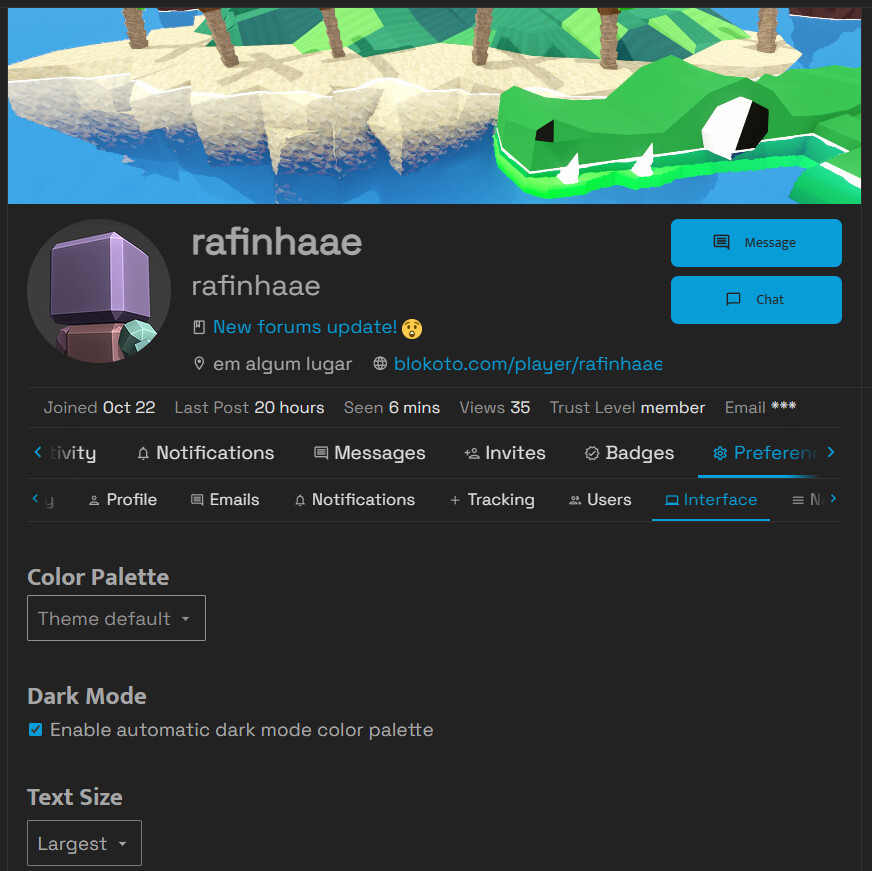
There is a text size setting on Profile > Settings > Interface
Well, the design from this forum, at least for me didn’t have a real reason to be changed, since the previous was enough.
I see the actual much less colorful and nearly confusing sometimes, because the lack of categories colors here before, it’s just something i feel.
But if is to be this way, nothing like getting familiar day a day along it to feel the same the previous appearance made what i felt every day.
I’ll try to bring back the category colors
For some reason, this looks like only applies for user profiles, as well as other pages like the About page and the Badges page. I don’t know if it’s the font itself or just me. ._.
That is unfortunate, the theme probably hardcoded text sizes ![]()
But, it is very resposive. You can use the native browser zoom feature to increase the text size as a workaround
I like the compact design with everything on one page. maybe its just me but I would remove the unnecessary stuff on profile page and few other things…