Hello guys! I’m creating this thread for feedback on the latest version, specifically on which features and issues should be prioritized for future updates.
Feel free to share your experience, and don’t hesitate to be direct if needed—constructive criticism is what makes good games even better!
3 Likes
Being really honest, i have barely seen no difference between the older version following to this actual one, with the exception of small changes in gizmos and especially the main promised feature: The game saving your progress.
Some things turned me into a disappointment feeling, when i saw many features once before working good, actually were almost broken at all, like the face selection, texture creator options and the way blocks could be even more liable in breaking in a certain way of modeling.
Although i know it’s such a long way walking into sculpting the game into a really playable thing with almost nothing to disturb the player experience, and the bugs are the most common and visible issues appearing even by surprising undesirable ways on every single project handling with programming, and we’re still getting on that goal to beat most of them at least.
Now into a wish of mine, i’d like to see more building features and tools for helping every project needings; the game has a lot of potential to desirable ways for building and creating such good sceneries, by aggregating and mixing of various techniques using them.
Anyway, that’s it for now, i hope to see more cool features along the time and see this project reaching even more its completition.
1 Like
It’s very impressive how quickly it’s being developed and I admire your dedication to this game, seriously, you’re incredible, I can’t say that enough.
Regarding problems, there are some recurring issues such as:
- Models not working properly and becoming invisible
- Blocks in certain circumstances are also invisible and cannot be deleted or edited.
- I made some key combination that built a certain entire area of blocks and I have no idea how I did it (maybe it’s a bug, or a feature that wasn’t explained in the help menu). As it turned out, this problem got in the way during construction, and I had to delete each block manually.
What would be interesting to prioritize for future versions, in the current state of the game?
- Fix these bugs, which could become a major problem in the future.
- Launch a game mode, even with limited resources. It’s not necessary now to have a model store, nor a social system, nor even character editing, but rather a possibility for the player to be able to enter a map and play the creations of others, in order to test how it works in-game during development, in the most primitive way in order to evolve incrementally over time.
- A way of defining the map’s default Spawn Point, it’s quite strange that even in edit mode, the editor spawns in the same position, sometimes even far away from other structures. Or better still, create a way of defining several spawn points and being able to “teleport” between them, this would speed up the process of switching between various editing areas. Of course, this would be for the editing mode; the game mode would have a standard spawn point.
These are the features we need at the moment, so players can create some interesting things using their creativity and in the meantime, more advanced features and bug fixes are added little by little until the stable version.
Other things:
- I think it’s a bug, but when you take a photo for the game cover, the grid (G) also appears. I particularly like this, you can do some nice effects, although it’s probably something unplanned.
That’s it, a basis for the next updates.
3 Likes
I prefer not to care so much for the lack of a spawn point at this actual stage of game project, since it don’t even make such a great difference when a play/test mode is not available with a playable character yet, to become it just a truly useful feature into our testing time when satisfying this actual needing first.
In addition to the issues mentioned above, I think the following could be improved:
-
The anti-aliasing on the interfaces is minimal (or absent), even with graphics set to the highest quality.
-
The photo capture icon doesn’t quite match the rest of the interface.
-
The border of the photo capture menu is much rounder than the other borders.
-
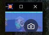
When switching from fullscreen back to windowed mode, the window resizes to a very small size, as shown in the following image:

-
The gizmo selection overlaps with other models.
-
Sometimes when editing a model, other models remain completely visible.
-
The grid isn’t infinite, so you can reach its edge.
These are the things I believe could be improved. In terms of performance, the editor ran very smoothly, reaching 60 FPS with Vsync and 120 FPS without Vsync on the highest graphics settings. That’s it.
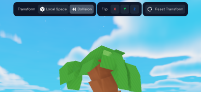
Well, one of the things I would like to see in a 0.1.1 version, would be to add this menu when selecting a model/object in the game, to facilitate the rotation of the models, like what currently happens with KoGaMa, but better

And something else to add, something like what mblithium said, start fixing bugs so that the player experience is not interrupted when creating something and thus give a better feeling to the player, that updates like 0.2.0 (store) and 0.3.0 (play mode) are made to wait a little longer, and after these maintenance updates are released, small but interesting features are added, so the community gets excited and can talk about it about it.
4 Likes
I don’t know if is only me, but i think that camera icon for game screenshot on the bottom corner a little nonsense, like something giving the strange impression of being just dropped out there all alone, and maybe hidden for a while when the player is searching for it to shot the picture. In short, the place for this item is just awkward, just see what i mean with an example:
Look how the icons match between each other like the KoGaMa ones below:

I’m not saying it must be the same thing, but following this concept of options, can look much better, and add some order mixed up with beauty for this. Maybe moving the icon to another side, or an amount of options uniformed into a menu can make this to be a better design choice.
1 Like
This would be really a great help when manipulating the model axis. By the way, we not even know what the hell is X or Y axis while switching between them, since it doesn’t have any label to recognize it.
Another bad thing is to switch the axis by pressing the R key on a continuous loop between the 3 there, because who would ever know if the guy wants to change from the X axis straight to the Z or Y, or in any kind of order when needed? UI Buttons are better without any doubt.
1 Like
Wszystko jeszcze przed nami zobaczymy jak to pójdzie
Please write in english to a better general understanding for everyone, because polish is kinda hard to read 


